
Protect Group · Case Study
Pulse Reporting Dashboard
Real-time insights that make your business better.
The result
3 months
From first concept to first live release
400+
Partners onboarded — adopted from day one
Daily
The Partnerships team's main tool for monitoring account performance
Pulse became the way most partners track Refund Protect performance, and internally it replaced the old bespoke-report cycle entirely.
At a glance
The problem
Huge volumes of partner revenue data sitting unused — no live dashboard, only slow, resource-heavy bespoke reports.
What I built
A real-time reporting dashboard with curated views per user group, adopted from day one.
The result
Shipped in 3 months, 400+ partners onboarded, became the Partnerships team's core daily tool.
The problem
Refund Protect and its ancillary products — Delayed Baggage Protection, Flight Disruption Protection, Carbon Offsetting, eSIM Solutions, Lounge Access — were generating a huge amount of revenue and transactional data across hundreds of partners. Almost none of it was being put to use.
The existing reporting dashboard was old and not user-friendly. Anything beyond it meant a team manually building a bespoke report on demand — resource-intensive, slow, and not repeatable. Partners had no way to see their own Refund Protect performance at all.
The data existed. The system to turn it into something usable didn't.
What I built
1 · Discover
I ran continuous discovery across three groups at once — internal teams, partners, and facilitators — gathering requests and learning what each actually needed to see and act on, rather than building one generic dashboard for everyone.
2 · Scope
Instead of a single view, I scoped the product around curated views for specific user groups, prioritising features with the team based on urgency, value, and complexity. I named it Pulse.
3 · Build
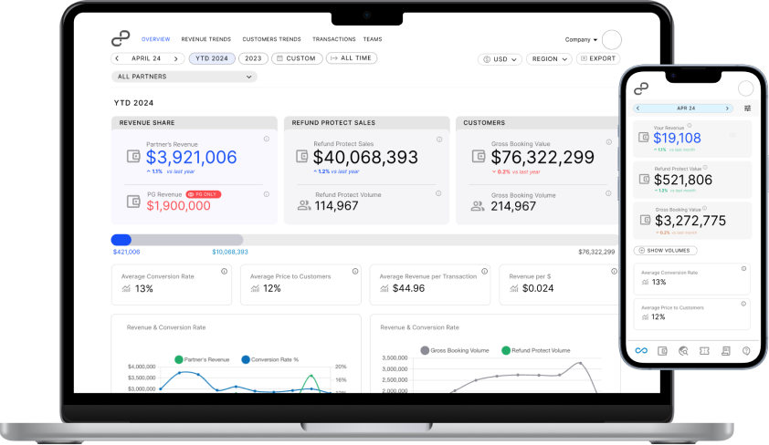
I designed every screen in Figma and handed it to the development team to build — real-time metrics and charts covering Refund Protect performance, revenue share, conversion rate, and more, per view.
4 · Validate & Launch
From first concept to a live version partners could access took 3 months. Adoption was immediate — partners started using it from day one, not after a rollout push.
5 · Iterate
I monitor usage through Microsoft Clarity and Google Analytics and keep shipping enhancements based on what the data shows, running Pulse as a live backlog rather than a one-off delivery.
The result
3 months
From first concept to first live release
400+
Partners onboarded — adopted from day one
Daily
The Partnerships team's main tool for monitoring account performance
Pulse became the way most partners track Refund Protect performance, and internally it replaced the old bespoke-report cycle entirely.
What Pulse looks like
A quick walkthrough of the dashboard — the curated views, real-time metrics, and charts partners and internal teams use every day.